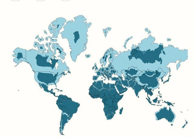
This was such a simple way to show how most maps distort the Earth especially the common Mercator projection. For years cartographers have tried to show both the position of land on the 70% water world that is the earth. In the case of the ubiquitous Mercator projection a nice rectangular map perfect for paper is made but the meridians that all converge at the poles are spread out as though that single point was the equivalent of the length of the equator.
I began pouring over atlases in grade school and have been aware of most nations relative size. Monstrous Greenland is huge but its the size of the Louisiana purchase or a third the size of our lower 48 states. But tucked under the north pole it balloons out of all proportion. What a simple way to show the island real size……. If I began teaching Geography again I would keep this in my arsenal.
By they way. I can identify about 99 percent of all the nation’s whose political boundaries are on this map. I learned all of them as I collected stamps in the 1960’s as the colonies were winning their independence. Some of the African nations have changed names and that’s the only continent that gives me any trouble. When I hear a news story about any of them I know instantaneously where they are on the planet.
